
|
Using Graphs to Compare Lift Variables
Activity
|

|
If so instructed by your teacher, print out a worksheet
page for these problems
This activity involves using the graphs created by FoilSim for
each of six variables to compare their effect on the lift of an
airfoil. We will analyze the graphs produced by each of the following
variables compared to the lift produced: airspeed, angle of attack,
area of the airfoil,altitude, thickness of the airfoil,and camber of
the airfoil.
Start
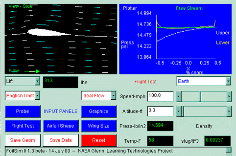
FoilSim.
On Version 1.5a of FoilSim II, you will notice a plot at the lower right of the screen.
The type of plot can be changed by using the "Output" pull down menu. Click on the menu
and choose "Plot Selection".
 1.
A selection of available plots now appears in the lower right screen. Let's plot the
lift versus the angle of attack. Click on the red on white
"Angle" button and a graph will appear in the lower righthand corner.
This graph shows how the lift changes as the angle of attack
increases or decreases. Analyze the graph by describing how the line
is shaped and explaining what the shape of the line means to the
change in lift. Enter your answers in a hard copy of the data table
shown at the bottom of the page. 1.
A selection of available plots now appears in the lower right screen. Let's plot the
lift versus the angle of attack. Click on the red on white
"Angle" button and a graph will appear in the lower righthand corner.
This graph shows how the lift changes as the angle of attack
increases or decreases. Analyze the graph by describing how the line
is shaped and explaining what the shape of the line means to the
change in lift. Enter your answers in a hard copy of the data table
shown at the bottom of the page.
2.
Click the "Output" menu button again and choose "Plot Selection". This time plot
lift versus the thickness of the airfoil. Click on the
"Thickness" button and a graph will appear that compares the change
in thickness of the airfoil to the resulting effect on lift. What do
you notice about the graph?
On the left side, set the angle to 0.0 and explain what happens to the graph.
Now, analyze the graph and fill in the data table.
3.
Push the red "Reset" button and then the "Output" pull down menu to "Plot Selection".
Plot the lift versus camber. Compare the
changes in camber and the resulting change in lift. Analyze and
record the data.
4.
Click the "Output" menu button again to "Plot Selection". This time plot
lift verus airspeed. Explain
what happens when the graph appears.
Change the angle to 0.0 and look at the graph again. What do you notice? Why?
5.
Push the red "Reset" button and then the "Output" menu button to "Plot Selection".
Plot lift versus altitude and notice the graph that appears.
Remember that when we examine altitude we are actually comparing the
density of the air in that part of the atmosphere. It is a good idea
to keep this in mind while analyzing the graph. Analyze your altitude
graph and enter data in the data table.
6.
Click the "Output" menu button again to "Plot Selection".
The final variable is the area of the airfoil surface.
Plot the lift versus wing area and analyze and record the data represented by the
graph.
Data Table
|
Variable
|
Description
|
Explanation
|
|
Angle of attack
|
________________
________________
_________________
|
_______________________________
_______________________________
_______________________________
|
|
Thickness of airfoil
|
_______________
_______________
_______________
|
_______________________________
_______________________________
_______________________________
|
|
Camber
|
_______________
_______________
_______________
|
_______________________________
_______________________________
_______________________________
|
|
Airspeed
|
_______________
_______________
_______________
|
_______________________________
_______________________________
_______________________________
|
|
Altitude (density)
|
_______________
_______________
________________
|
_______________________________
_______________________________
_______________________________
|
|
Area of airfoil surface
|
_______________
_______________
_______________
|
_______________________________
_______________________________
_______________________________
|
Questions:
- What does a graph with a straight line tell us about how the
data changes?
- What does an upward curve indicate on a graph?
- How does the data change if you have a line that curves
downward on your graph?
- Which lift variables seem to change at a steady rate?
- Which lift variables tend to change at an increasing rate?
Decreasing rate?
|