This answer is incorrect.
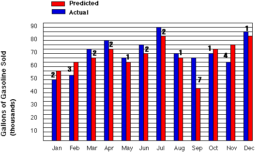
If you look at the figure below, you will see that it is the exact same figure as in the question except that some of the grid lines were removed for clarity. You will also notice a number above each set of bars. This number represents the difference between the predicted amount of gasoline sales and the actual gasoline sales.
As you can see September has a difference of 7 which is the greatest of any of the months.
Now let us try another one
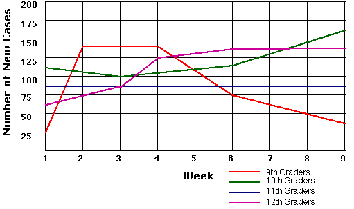
The students in Ohio began breaking out in a strange disease marked by green spots all over their bodies. This graph shows the number of new cases that were diagnosed each week. Which group of students seemed to develop an immunity to the disease?
Web Related:
David.Mazza@grc.nasa.gov
Technology Related: Thomas.J.Benson@grc.nasa.gov
Responsible NASA Official:
Theresa M. Scott (Acting)