This exercise is designed to integrate the use of Appleworks in a
mathematics classroom. Although the instructions are for Appleworks,
sample data is given and can imported into any spreadsheet program.
The purpose is to show how spreadsheet programs can be easily
implemented into a classroom setting. A Appleworks version of the
instructions are available to be downloaded
and used off-line.
-
- Double Click on the Appleworks Icon.
- Click on the circle for a new spreadsheet.
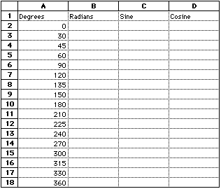
- Put the cursor in cell "A1" and click to highlight.
- Type the word "Degrees".
- Press Tab and type "Radians". Press Tab again
and type "Sine", press Tab and type "Cosine".
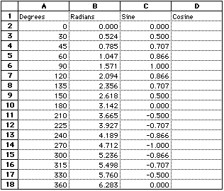
- Move the cursor to cell A2, click to highlight. Type in
the following degrees into column A starting with cell
A2:
		0		120		210		300
		30		135		225		315
		45		150		240		330
		60		180		270		360
		90
Current view of spreadsheet
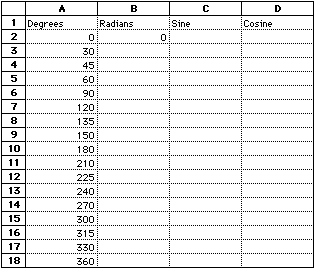
- Highlight cell B2. Click on Edit and drag to
Paste Function. Within the pop up menu, scroll to the function
called Radians(degree number). Double click on this function. You
will notice in the text box, "degree number" is highlighted in
blue. You need to put a number representing degrees in place of
those words. Since in column A you have the list of degrees
you want to manipulate, you can just click on cell A2. Now
you will notice that A2 appears where the words degree
number use to be. Press return. What has happened is the
radian of 0 degrees has been calculated and the result is now
listed in cell B2.
Current view of spreadsheet
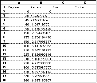
- Now click on cell B2 and hold and drag to cell
B18, so that all of the cells in-between are highlighted.
Click on Calculate and drag to Fill Down. You will now
notice that the radians of all of the degrees listed in column A
have now been calculated.
Current view of spreadsheet
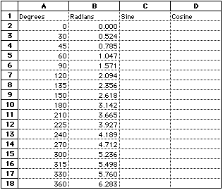
- You will notice that the format of the numbers that have been
calculated are in scientific format. To make the numbers easier to
read, keep the same set of cells highlighted, B2 through
B18. Click on Format and drag to Numbers. In
the pop up menu, click in the circle in front of the word fixed.
In the blue box, next to the word precision, type a "3". Click
OK. Notice now that your radians are all displayed in
decimal format to the thousandth place.
Current view of spreadsheet
- Highlight cell C2. Click on Edit and drag to
"Paste Function." Now scroll to the function Sin(number).
Click on Sin(number) and click on OK. Again notice
in the text box that the word "number" is highlighted. Just as we
did for the radians, click on cell B2 and press
return. The sine of 0 radians has just been calculated.
- Highlight cells C2 through C18, click on
Calculate and drag to Fill Down to calculate the
sine of all of the radians listed in column "B."
- Just as we did before, click on Format and drag to
Numbers. In the pop up menu, click in the circle in front
of the word "fixed." In the blue box, next to the word precision,
type a "3". Click OK.
Current view of
spreadsheet
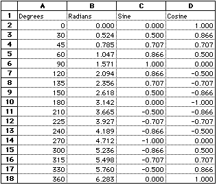
- Now do the next column on your own. Find the Cosine of the
radians listed in column B.
Current view of
spreadsheet
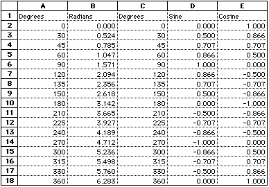
- Now we will graph Degrees vs. the Sine and Cosine of those
degrees. To graph all of the columns that are going to be graphed
have to be next to each other so we need to move the degrees
column next to the sine column.
- Click on the letter C in the column headings to
highlight the entire C column. Click on Calculate and drag
to Insert Cells.
- Now highlight cells A1 through A18. Click on
Edit drag to Copy. Now highlight cells C1
through C18, click on Edit and drag to Paste.
Current view of
spreadsheet
- Now we are ready to graph. Click on cell C2 and drag to
cell E18. Click on Options and drag to Make
Chart.
- We will go through each of these options listed on the left
hand side starting with "Gallery" which is currently active.
- "Gallery" is where the type of chart is chosen. Click on the
box with the word "Line" underneath it.
- Next click on "Axis." Notice that the Y axis circle is
darkened, we will first be working with this axis. In the box next
to the words "Axis label" type "Sine/Cosine". If you would like to
change where the tick marks are located, you may use the pull down
menu next to the words "Tick Marks". Additionally, when the box
next to the words "Grid Lines" has an "X" in it, grid lines will
be displayed on your graph when the box is empty, there will not
be grid lines. Now click in the circle next to the words "X axis".
In the box next to the words "Axis label" type "Degrees". Again,
choose where you would like the tick marks and whether or not you
want grid lines.
- Click on "Series." This pop up menu will let you specify what
your data points will look like. You can choose whether or not you
want your data points labeled and where around the data point you
want it displayed. Make sure the box next to "Label Data" has an
"X" in it and click in the center left hand circle below it. In
the pull down menu next to the words "Edit Series," choose "Series
1." Make sure the box next to the word "Symbol" has an "X" in it
and click on the hexagon symbol. Next choose "Series 2" from the
pull down menu next to the words "Edit Series", make sure the box
next to the word "Symbol" has an "X" in it and click on the
diamond symbol.
- Click on "Labels" Type in the text box next to the word
"Title" "Sine Wave and Cosine Wave Plot" Click on the box next to
the word "Legend" so there is no "X" in that box.
- Click on "General" In the lower right hand column where the
words "Use numbers as labels in 1st row and 1st column" appear,
click on the box next to "1st Column" Click "OK"
- With the pointer click and hold on the chart you have just
made and drag it to the upper left hand corner of your screen. Now
place the pointer on the lower right hand black square, click and
hold and drag towards the lower right hand corner of the screen to
make the chart larger.
Current view of
chart
- If there are any further modifications to be made to the
chart, highlight the axis or the title, for example, and use the
format menu to change the font, size, style, etc. of the text.
Also click on "Options" and drag to "Modify Chart" to go back to
the pop up menus that were just used to make the chart.

